Binary Options Charts – Why, What, How?
Financial analysis is divided into two main schools of thought: on the one hand, we have Technical Analysis and on the other hand we have Fundamental Analysis. Although opinions are divided about the profitability of one or the other, both have something in common – charts. Of course, fundamental analysts use charts less than technical analysts, but any trader is blind without a chart. It’s like trying to drive a car without seeing the road ahead. Unfortunately, Binary Options charts seem to be the least of the brokers’ worries and all they offer us are primitive and useless charting packages. Sometimes Binary Options charts are no larger than my cell phone screen, but brokers think we can use them to analyze an asset’s performance. Really?!
Types of Binary Options Charts
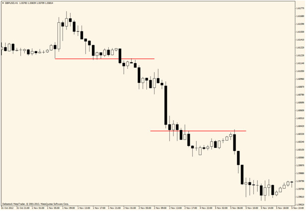
Basically, charts are a graphical representation of an asset’s performance during a predefined period of time. This definition doesn’t apply only to Binary Options charts, but to all financial charts that track an asset’s movement. There are three main types of charts: Candlestick charts, Bar charts (also known as OHLC charts) and Line charts, most traders find trading with Candlestick charts the best. All of them have particularities and can be used for different purposes, but their main use is for analyzing how an asset moves and how it reacts to economic or financial news and support and resistance levels. Of course, we could argue that the same thing could be seen if we just watch the quotes, but tell me, how would you rather analyze the movement of an asset? Like this: 1.32433… 1.32476… 1.32498… 1.32391… 1.32330… 1.32156… or like this:

Although I can understand the first string of numbers and I know they represent quotes, it’s far more useful to look at the chart and see how the prices behaved. In fact, in the early days of trading, prices were represented similar to my numbers above on paper printed by ticker tape machines and investors read the tape in order to get a feel of the market’s direction, if they wanted a chart they had to draw it themselves. This technique of trading is called “tape reading” but once technology advanced, trading evolved also and electronic charts appeared. When this happened people started to notice that prices made patterns and that chart patterns could be predicted. I mentioned three types of charts so let’s go into them in a bit more detail:
Candlestick Charts
These were developed in feudal Japan and the “father” of the candlestick chart is considered to be Munehisa Homma, a rice trader who lived in Japan during the 18th century. A candlestick shows us the opening and closing price, but also the distance traveled during the period (open and close are usually different than high and low) and holds important insights into the market’s behavior because it tells the story of how prices moved during the period. For example, a long wick shows that initially the price traveled the entire distance but traders could not maintain enough pressure to close the price there and instead, the other side of the market took control and reversed the price. When you look at the chart Japanese Candlestick signals jump off the page in way that makes the bulls and bears look like pieces on a game board, all you have to do is read the.
OHLC or Bar Charts
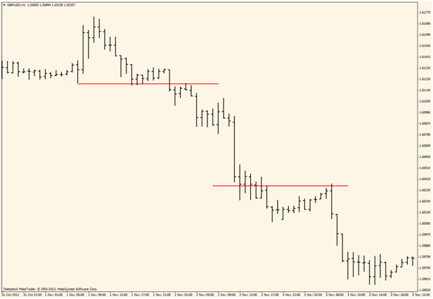
The abbreviation stands for Open High Low Close and the bars are very similar to candlesticks. In fact, they show the exact same information but have a different graphical appearance:

Choosing between a candlestick chart and an OHLC chart is just a matter of personal preferences because they show the same information, but to me candlestick charts look better, probably because it is the only type of chart I ever used.
Line Charts
This is the most simplistic type of chart and it shows price movement as a line. It doesn’t provide solid information about open, close, high or low and also, it doesn’t show what happened in the period analyzed. For example, if you are using a one hour candlestick chart or OHLC chart, you will notice how the price moved during each hour but a Line chart doesn’t provide such information. Unfortunately, this is the most common Binary Options chart and most brokers show us quotes with the use of such a chart. Below you will see a Line chart but the screenshot is taken from Meta Trader 4 and it still offers more information than a Line chart seen on most binary options platforms.
Understand Your Chart
Charts can tell a lot of information that in the wrong hands can result in catastrophic losses. You need to know what it is that you are looking at which is why education is important. The most important thing to take note of is the time frame of the chart. Is it short term, long term, mid term, near term, ultra short term, one day, two day, one minute, one week, one month or any of a dozen more time settings. Failing to recognize this can result in using the wrong expiry, or even making the wrong analysis, if the candlestick in question is not complete. Something else that is just as important, maybe more so for the real short term traders, is lag time. Not all charts give real time live feeds. In most cases free or easy to access charts will have a lag time as a large as 15 or 20 minutes and that is not good for taking signals NOW.
Ok, Where Can I Get a Chart?
Usually brokers don’t pay a lot of attention to their charting package and they don’t really understand how essential this is for a trader. Trading without a chart is like trying to cross the street blindfolded. Sure, if you’re lucky you might make it to the other side of the street… but I wouldn’t try it. Since Binary Options charts offered by our brokers are not too helpful, we must look in other places for them. The best way to do that, in my opinion, is to get a free demo from a Forex broker who offers Meta Trader 4. Then you will have all three types of charts available, indicators, Fibonacci tools and everything you need to conduct a proper analysis. Trades will be executed of course on your Binary Options platform, but this way you have the best of both worlds: the simplicity of trading Binary Options and the complexity of a proper charting package. There are lots of packages thought, the best place to find out about them all is in our forum dedicated to Charts, Charting and Charting Packages.
A New Trend Emerges
Lately, Binary Options Brokers have started to offer candlestick charts as well as line charts. This is definitely an improvement and makes analyzing price easier but these charts still lack history and you cannot make an accurate prediction if you are not able to scroll back and look for support and resistance levels or chart patterns. Either way, the fact that brokers start to pay attention to the technical side of trading, means that soon we will see more and more tools, advanced charts and maybe even technical indicators (a few top-tier brokers already offer technical indicators). Once Binary Options Brokers will offer us a complete charting package, it will become easier for us to trade because we won’t have to switch between platforms anymore and both trading and analyzing will be done from the same chart, as it’s supposed to be.