StockPair’s Mobile Trading App Review – IOS and Android
StockPair Now on Android and Apple – Mobile Trading Review
Stockpair’s mobile app is finally here! Mobile trading is popular today and every broker competes with other brokers when it comes to programming the best app. Obviously, functionality is a very important aspects for an app that is supposed to deal with your money but nowadays a chic design is also a serious matter. Performance has become a pretty much self-explanatory subject so it is up to the designers to attract you! Is Stockpair’s new trading app up to the task or not?
The following tests were done on a Samsung Galaxy S4

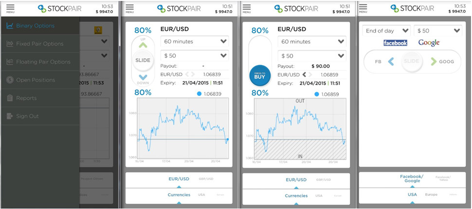
From left; 1. The Menu includes reports that shows your trade history and more. You can view open positions and chose to close the long term trades. Also, choose between three varieties of options. 2/3. An example of currency trade, you simply hold the slide button and drag it either down for put or up for call. The button then becomes blue as you see in picture 2 where it says “press to buy”. 4. An example of a pair option.
Speed
To test the speed, I placed many 60s and 90s trades one after another. The platform was very quick in response and I could quickly slide back to place yet another trade. The menu opens in a second and the sliding and pressing functions executes every action in a blink of an eye. Browsing through the assets can be done quickly thanks to the sliding feature!
Ease of use and Functionality!
Slide n’ buy! It is as simple as that. However, it wouldn’t have hurt with a few explanations directly in the app when you run it for the first time. Maybe I am too stupid but at first I was trying to slide the arrows instead of the round button. I was also desperately looking for a buy button before I realized I needed to drag the circle first. But then again, it doesn’t really take a genius to figure it out and I was only clueless for barely half a minute before I understood how it works. Once you’ve figured out the whole slide n’ buy or slide n’ select feature there’s nothing slowing you down. To view more assets, there are two slide-able menus at the bottom of each page. Simply slide to either right or left and you can browse among other instruments to find the one you are looking for. Overall, the app runs without any problems. It does the job and it does it smoothly so there are no issues to report here.
Expiry times and other features
The expiries are just like on the real platform. Choose from 60s, 90s or as many minutes as you like. You can even place trades with expiries set for the end of the month and a maximum of 150 days for the real hardcore long termers. Another important feature is the sell option which is included in the app too! It is exactly as in the web platform, you can only sell long term positions starting from end of day and longer.
Crashes, bugs, freezes and other annoying stuff
I did not experience any crashes or freezes. The only annoying “bug” that I noticed was the following error message that I got: “due to market conditions your trade could not be executed”. I only had this issue a couple of times and I would say this is not really a bug. This is a safety “mechanism” that is there to protect traders from entering a market that is too volatile at the moment. However, for some fast paste loving traders this might turn out annoying in the long run.
Availability
Stockpair’s app is available on both the App Store and Google Play.
Overall look
Looks do matter and Stockpair is indeed aware of that. The app looks nice and inviting. The colors are the same as in the real platform as you can see in the pictures above. Even though they only had a limited number of colors to use, mostly white, they still managed to pull off a chic atmosphere that welcomes you into exploring it.
Main difference between the computer platform and the mobile app
On the PC version you have access to more material, which is usually the case with all the apps I am familiar with. The mobile app does not include education and the features for making deposits, withdrawals and changing the language. The market review and live chat support are not available on the app either.
Conclusion
I like this app, it looks great and the slide n’ buy feature is a smart idea! The slide feature eliminates the need for having to place extra buttons and wasting valuable charting space.
The bright colors are inviting and refreshing, making it easy to see text and numbers.
It sucks that there wasn’t at least a few hints the first time I opened the app. For someone who isn’t familiar with using trading apps it could be difficult to understand how it works. On the other hand, once your eyes manage to locate to where it says “slide” you are all good to go. Because that’s basically all you need to know! The error message about “market conditions” was a small drawback and I would say that it is a “having the cookie and eating it” kind of situation. You want protection against a volatile market and at the same time you want to be able to act quickly, right? Nevertheless, it was not a big issue because this only occurred a couple of times which makes it insignificant in relation to the number of trades that I took.